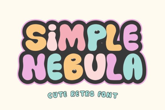
Simple Nebula: A Playful Retro Display Font for Web Design
As a UI designer who ships landing pages, SaaS dashboards, and e-commerce experiences daily, I reach for display fonts like Simple Nebula when I need instant personality—without sacrificing clarity or loading performance. It’s not just another retro font. It’s a bold, friendly, tightly spaced typeface with rounded terminals, subtle geometric structure, and that unmistakable 80s arcade-meets-90s zine charm. Designed intentionally for digital use, Simple Nebula delivers visual impact at scale while remaining legible on modern screens.
In practice, Simple Nebula excels where hierarchy matters most: hero section headlines, product name tags, CTA buttons, course title cards, and brand-driven banners. Its weight and rhythm command attention without shouting—ideal for conversion-focused layouts where users scan in under three seconds. Unlike overly ornate script or condensed display fonts, Simple Nebula maintains generous x-height and open counters, supporting readability even at smaller sizes (24–36px) on mobile viewports.
For online stores selling handmade goods or creative tools, Simple Nebula adds warmth and approachability to product headers—think “Limited Edition Sticker Pack” or “New Drop Live Now.” On coaching or wellness sites, it softens the tone of value propositions: “Your First Session Is On Us” feels inviting, not clinical. In portfolio sites, it anchors project titles without competing with imagery—especially effective over muted gradients or soft-focus backgrounds.
Where Simple Nebula Fits in Your Layout System
Simple Nebula is a display font, so treat it as a strategic accent—not body copy. Use it for:
- Hero headlines (60–90px on desktop, 40–56px on mobile)
- Section dividers like “What Clients Say” or “How It Works”
- Button labels with high contrast (e.g., “Get Started Free” on dark navy or coral)
- Logo lockups or wordmarks where brand voice leans playful and confident
- Animated micro-interactions, such as hover states on feature cards or testimonial toggles
Avoid using Simple Nebula for paragraphs, form labels, navigation menus, or anything requiring sustained reading. Its retro character shines brightest in short bursts—under seven words per line—and benefits from ample letter-spacing (0.05–0.1em) in CSS for optimal rhythm.
Pairing for Digital Clarity and Brand Consistency
Simple Nebula pairs naturally with clean, neutral sans serifs—think Inter, Manrope, or Work Sans—for body text and interface elements. This contrast reinforces visual hierarchy: Simple Nebula sets the mood; your sans serif delivers the message. For editorial-style blogs or digital magazines, try pairing it with a warm, readable serif like Lora or Crimson Pro—but only for headings. Never pair it with another decorative font; the result dilutes focus and weakens brand signal.
On dark mode interfaces, Simple Nebula holds up well against deep charcoal or matte black backgrounds—just ensure luminance contrast meets WCAG AA (minimum 4.5:1). On light backgrounds, avoid pure white; opt for off-whites or soft creams to reduce glare and support long-session comfort.
Responsive Behavior and Real-World Readability
Simple Nebula renders crisply across Chrome, Safari, Firefox, and Edge—including iOS and Android WebView. Its OpenType features include standard ligatures and basic multilingual support (Latin Extended-A), covering English, Spanish, French, German, and Portuguese—enough for most global-facing landing pages and SaaS onboarding flows. It’s available in WOFF2 format for web use, with optional variable axis support depending on the foundry release.
On mobile, keep headline lines to one or two words max. Avoid stacking multiple Simple Nebula elements vertically—instead, layer it over a subtle background shape or icon to anchor the eye. For image overlays, use a semi-transparent dark or light scrim (15–25% opacity) behind the text to guarantee legibility regardless of source image tone.
Licensing and Production Readiness
Simple Nebula is a commercial font, meaning you’ll need an appropriate license for live websites, client projects, online stores, and digital templates. Most reputable vendors offer perpetual web licenses with unlimited pageviews—ideal for SaaS products or high-traffic blogs. Always verify whether the license covers self-hosted webfonts (recommended for performance and privacy) versus third-party CDNs. If you’re building a theme or template for resale, confirm extended licensing terms upfront.
When integrating into your design system, document usage rules clearly: define exact sizes, spacing values, color palettes, and fallback stacks (e.g., font-family: 'Simple Nebula', -apple-system, BlinkMacSystemFont, 'Segoe UI', sans-serif;). This ensures consistency across dev handoff, marketing assets, and future redesigns.
Why It Works Beyond Aesthetics
Typography isn’t decoration—it’s functional communication. Simple Nebula supports user engagement by signaling tone before a single word is read. A fintech dashboard using it for “Welcome Back, Alex” feels more human than one using a sterile system font. An indie course platform using it for “Level Up Your CSS” conveys energy and accessibility—not gatekeeping. That’s the quiet power of a well-chosen display font: it aligns visual language with audience expectation and business goal.
In a landscape saturated with minimalist sans serifs, Simple Nebula offers differentiation without distraction. It’s not trying to be everything—it’s designed to do one thing exceptionally well: make digital spaces feel intentional, joyful, and unmistakably yours.